The solution
What I did
I know… I know. Starting with the end. Hey if it works for Tarantino, it's good enough for me!
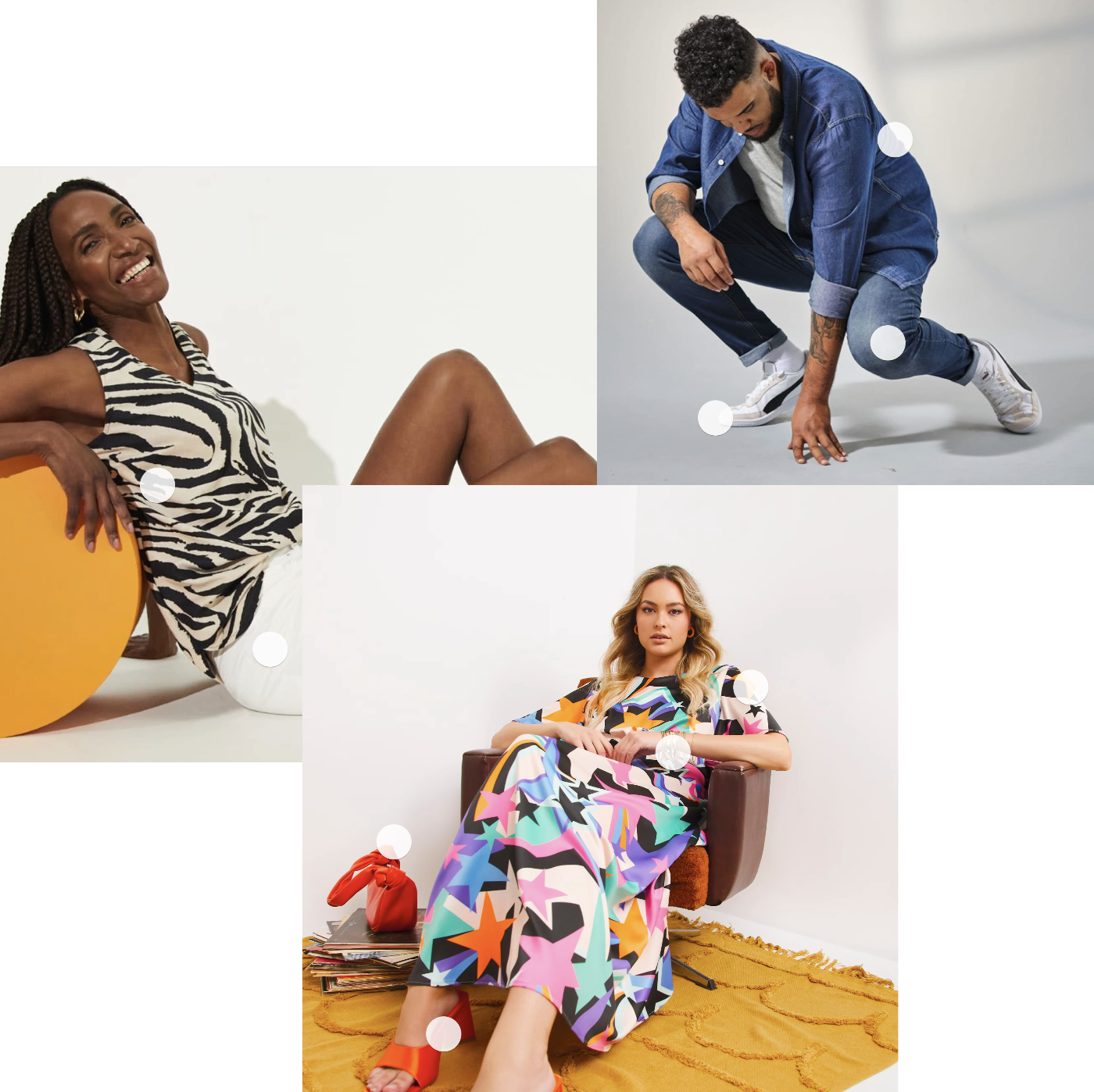
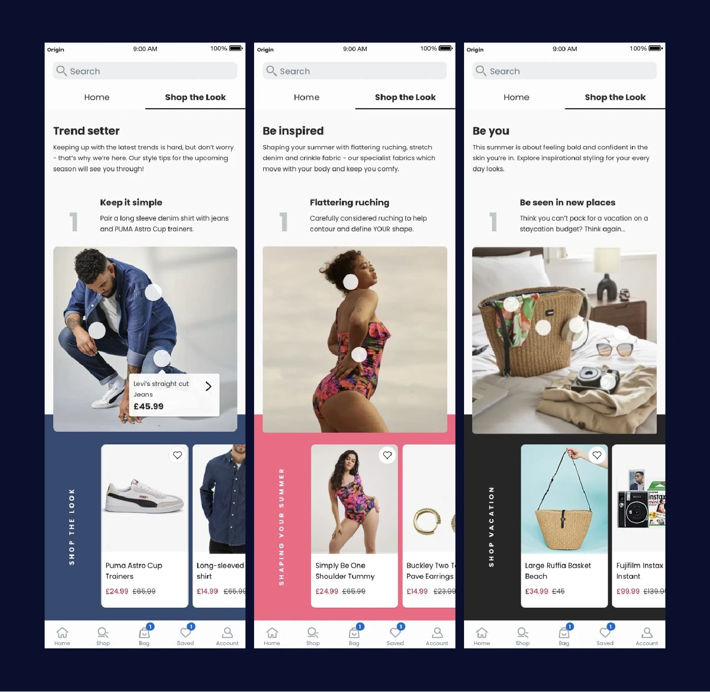
First impressions really do count though - when you see images like this, they evoke a much stronger reaction than just seeing, let's say, a t-shirt on a hanger, or a pair of shoes by themselves.
How it works
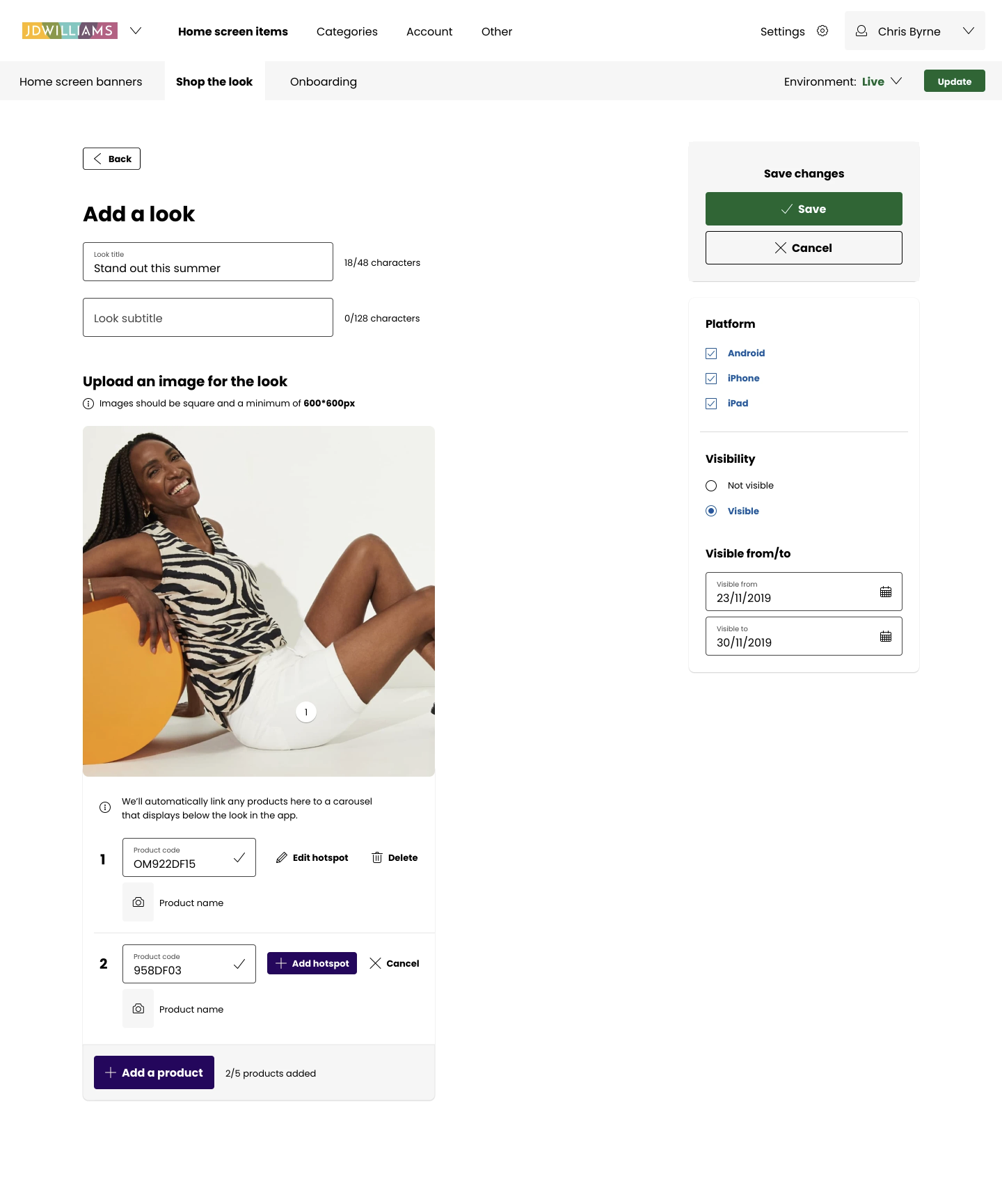
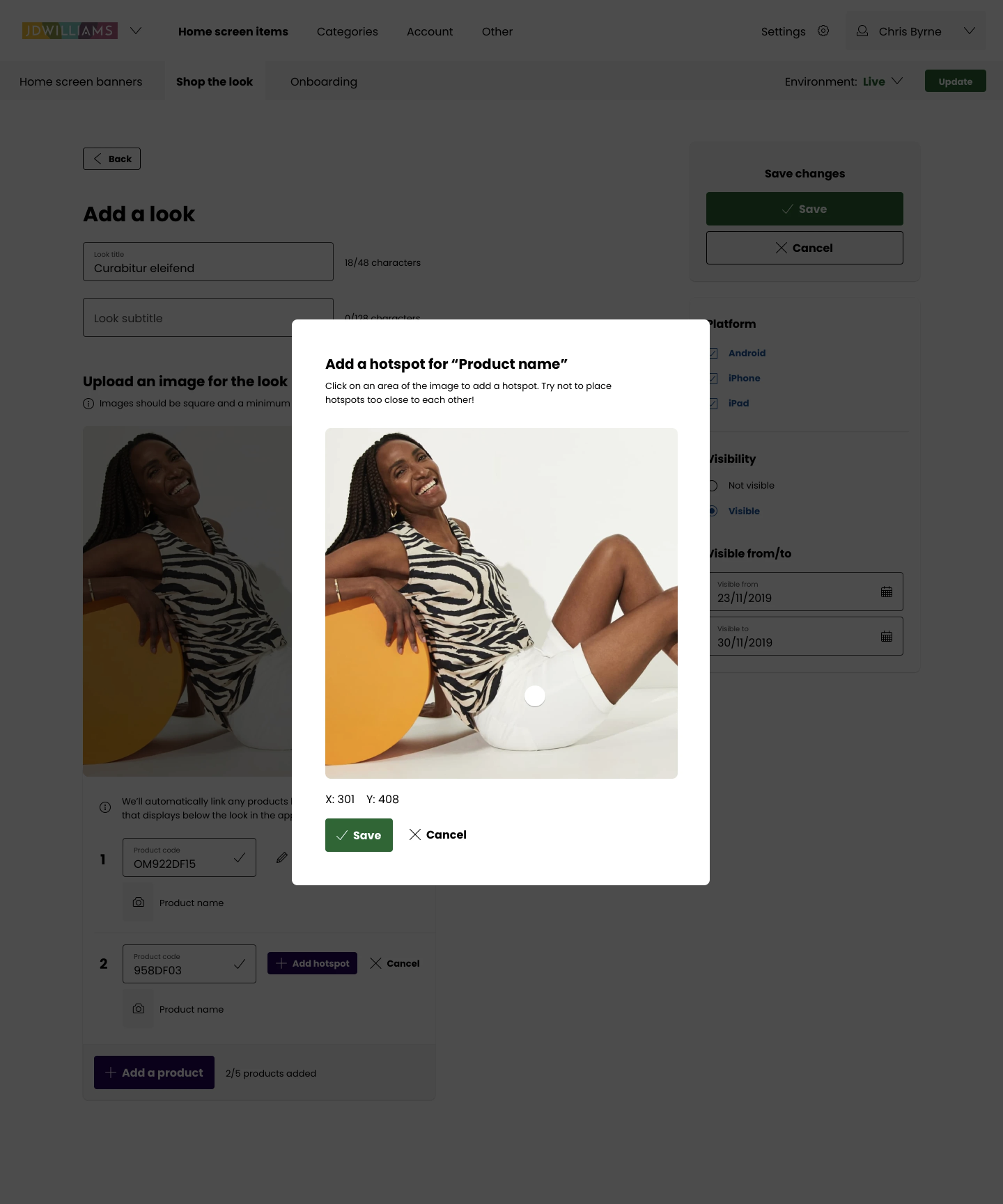
It's a single image with hotspots over the top, managed within a CMS. The hotspots are linked to products that are also displayed in a horizontally scrolling carousel below.
The results
Across all brands, the Shop the Look feature increased PDP (Product Detail Page) click-throughs by 3%, and increased add to bag rate by 1.5%. For the brands with Shop the Look turned on, average shopping bag value increased by £10.
The problem
So... what was the problem?
The typical customer who shops with N Brown is particularly size conscious. Throughout each of the three main brands, we often had customers feeding back that they felt frustrated that they had no guidance on how to put an outfit together that would suit their body type.
Products existed in silo with no real link to any others and as such, customers felt as though they were shopping alone, without guidance or expertise to help in any way.
We felt there was a way we could help customers feel more confident in their purchases as well as feel more confident in themselves, whilst also increasing conversions & decreasing bag abandonment.
Approach
What was my approach?
Discovery session
I took part in a discovery session ran by the CRO team to collate and share customer feedback with UX team members and PMs for web and app. They brought to us the problem outlined above 👆
Personas
Following the information gathered in the discovery session, we created three user personas as a team. The personas were put together by taking qualitative and quantitative data from the research undertaken by the CRO and UX research teams. This allowed us to really get a picture of the types of customers we were going to be designing this new feature for.
Sam
A 60 year old woman who is quite into fashion but would like validation about her choices. She feels like she’s labelled as an older woman and most places market boring outfit choices at her. Wants her clothes to reflect her bright outlook on life. Shops at M&S, Debenhams. Has quite a lot of expendable income and often goes on holidays with her friends.
💥 Relevant pain points from the current experience: Too many irrelevant sections on the first screen of the app that aren’t appealing to her.
Paul
A 45 year old man, size conscious, unsure on or doesn’t really care about fashion, but would like inspiration on what to wear over the summer. Usually shops at Asos and Topman, but doesn’t feel his size is represented in their marketing or in their product offering. He doesn’t have a lot of expendable income and is always on the look out for a deal. Loves rugby, the occasional beer with friends and has a young family.
💥 Relevant pain points from the current experience: It’s hard to find outfits that go together as there’s no advice, and no products are linked to each other.
Grace
A 33 year old woman, plus size, is into fashion but doesn’t really know what to wear for her shape. Shops for clothes exclusively online and sometimes with Simply Be. She regularly buys items bigger and smaller than her actual size, then returns the ones that don’t fit. Always looking for a bargain but will spend more if she knows that it’s the perfect outfit for her. She loves summer festivals and bright colours.
💥 Relevant pain points from the current experience: She often feels misrepresented in terms of model size, even with a size conscious company like Simply Be.
Workshops
Design workshop
The UX team organised a design workshop with 10-12 people who volunteered from various teams within the business, to quickly generate and discuss a wide set of ideas from different perspectives.
This was session was used to brainstorm ideas for the Shop the Look design challenge. We ran a crazy 8s session with dot voting to gather the best ideas from the session to help decide on which ideas to take back to the UX team to develop further.
This was a really enjoyable session - a great way of generating ideas, but also a brilliant way for people from other areas of the business to influence the design direction of new features.
Prioritisation session
I took part in a session with key stakeholders from the app and web teams and came together to understand which platforms could develop the journey. We decided it would be best to develop for apps as the functionality required would be too difficult to achieve on web with the current codebase.
Separately, I worked with the PM for the project and members of the CRO team to come up with a few 'how might we' statements before I started the initial design work.
How might we...
… show outfit selections to our customers so they can feel more comfortable in purchasing a full outfit?
… make sure that a customer can find other items within a look?
… let customers know about this new feature?
Designs
Initial design work
From sketches to sketch
I took the sketches from the design workshop and brought together the best ideas and began to create digital wireframes using some pre-made design system components in Sketch.
Based on the research and user personas we created, it became clear that the entry to the shop the look feature would be best positioned right at the start of the browsing journey to capture customers looking for outfit inspiration. This would be great for marketers to add new content for every season (or more often if they desire), and would allow them to add up to 6 different ‘looks’ at a time - catering for most tastes and styles.
Whilst my initial idea was to use a tabbed approach, stakeholders from Jacamo and Simply Be wanted to see a version of it directly on the homepage of the app - so I created a wireframe to show this.
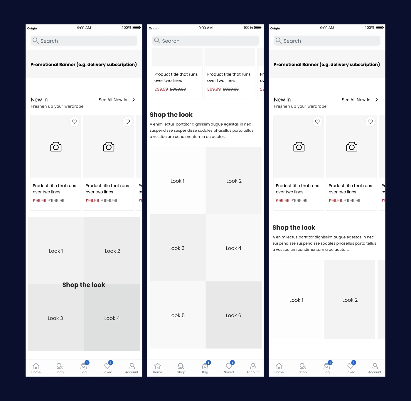
After looking into existing UI patterns available to us within Material and iOS, I decided to add a tab at the top of the homepage to house Shop the Look. I felt the tabbed functionality would be familiar to users on both platforms and would offer a permanent place for Shop the Look, as opposed to having an impermanent banner or section on the home screen. Having its own area within the app, I felt would allow the teams to add much richer and more engaging content due to the amount of space available.
Myself and stakeholders from the brands agreed that this was the approach to go forward with, so I continued with this design direction.
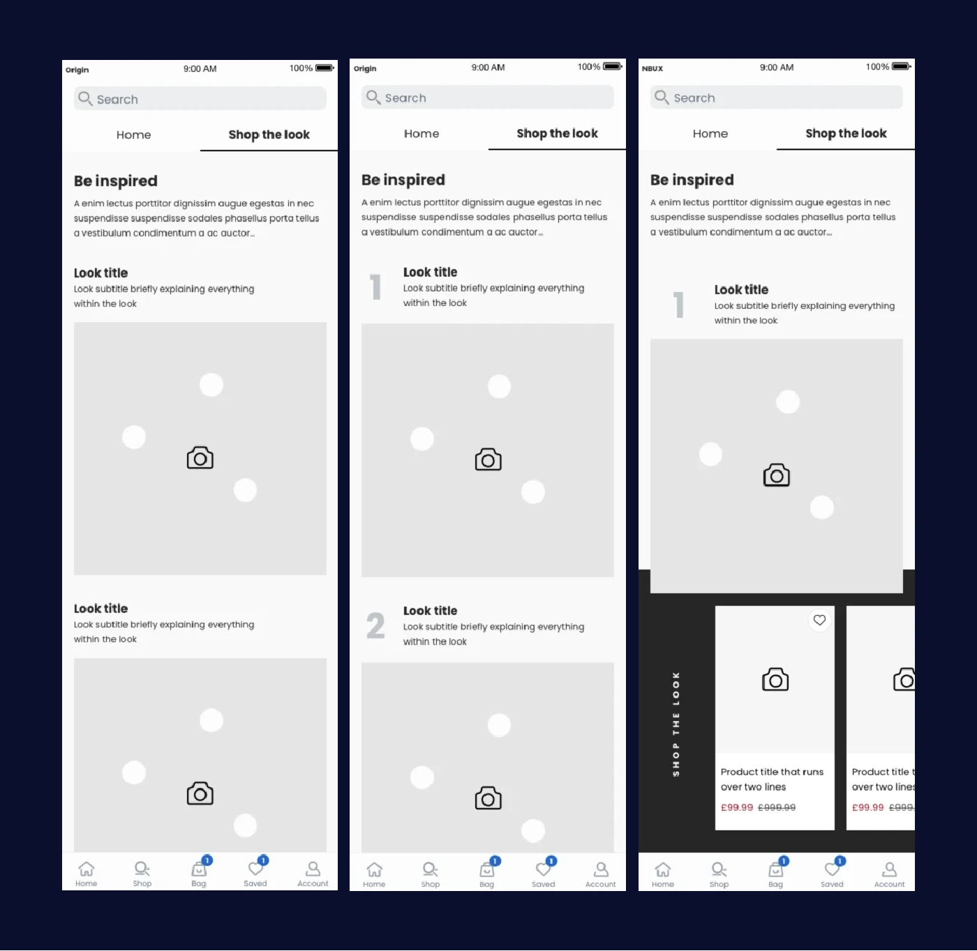
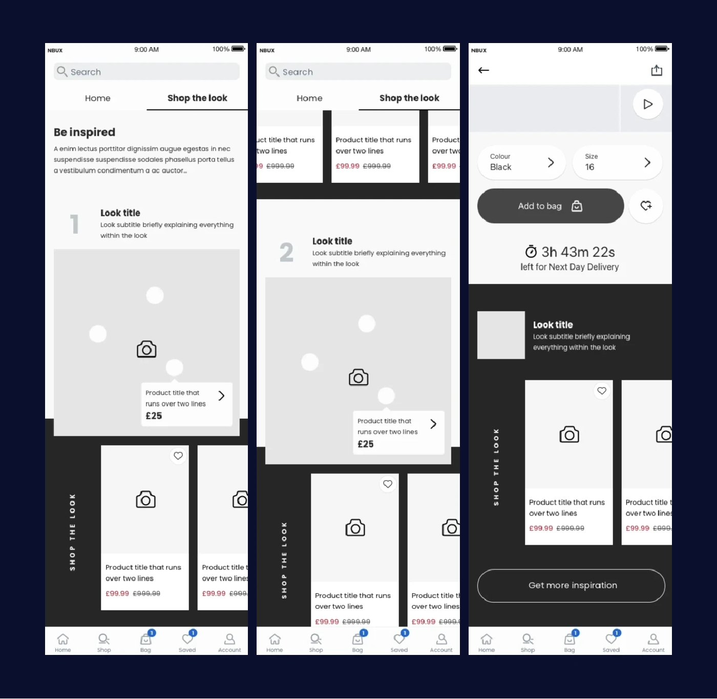
The journey
The wireframes done at this stage were used to create a prototype to share with engineers and PMs to ensure the proposed functionality was achievable.
High fidelity
High fidelity designs
Bringing things to life
At this point after internal feedback, we were happy with the wireframes and the journey, so I started on high fidelity designs and a second prototype which would be shared with app engineers. These were created over the course of another sprint.
Alongside the work for Shop the Look I had been leading the visual design of our design system. This felt like a great opportunity to slowly start to merge the old and new design languages together.
Look! Something new!
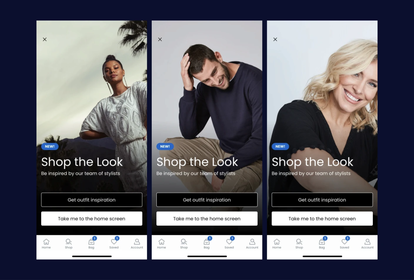
I explored ways to introduce the new feature to customers. One idea was to add an overlay before the home screen to highlight Shop the Look, and include a call to action to go straight to it. The development of this came later, but was used flexibly going forward to advertise new features, giving the marketing team the ability to change the image, text and buttons.
Overcoming some issues
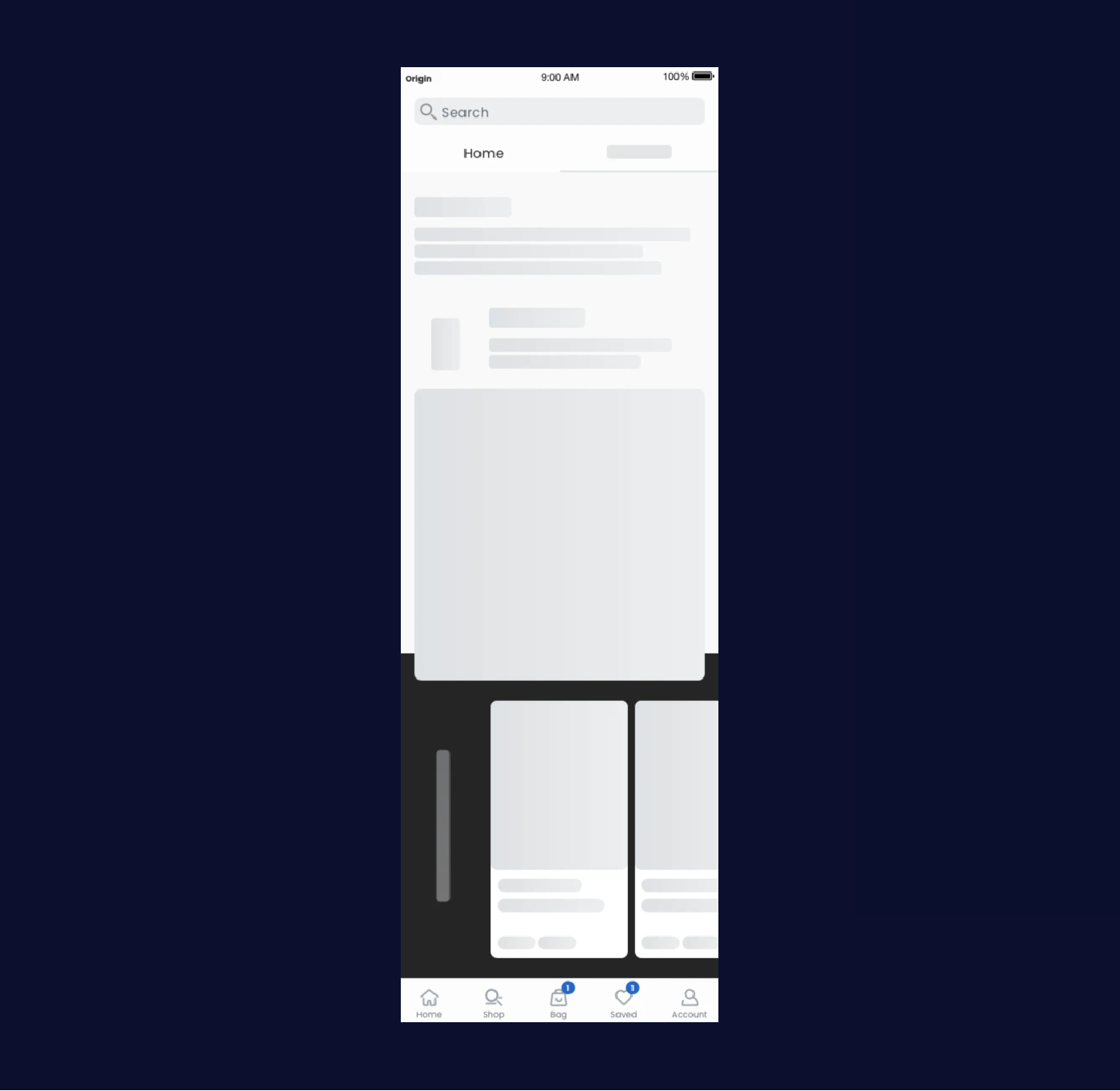
During the development phase, the app engineers discovered that the Shop the Look feature was downloading images and content quite slowly over a mobile network, and would often show a blank space for a little while before loading in the 'looks'.
We were concerned that this would lead to quite a bit of frustration from a user perspective, so to help combat this, I created designs for 'skeleton' states for each element. They would act as placeholders for the content until it downloaded fully. This was later implemented everywhere in the app.
I shared branded designs with separate stakeholders from each brand (Jacamo, Simply be and JD Williams), then carefully considered their feedback. Some great ideas were discussed, and we agreed that a second phase of Shop the Look would be worked on in the future, following a similar design process.
From this session, however, it became clear that there wasn’t any existing capability in the back end of the app to support what we were trying to build.
CMS
Content Management System
Following this shocking discovery (😱), I was tasked with creating a new section in the CMS for the app. At this time, I was also working on an early version of the Origin (later NBUX) design system, so we took the opportunity to implement parts of the design system into the CMS and test parts of it with internal users.
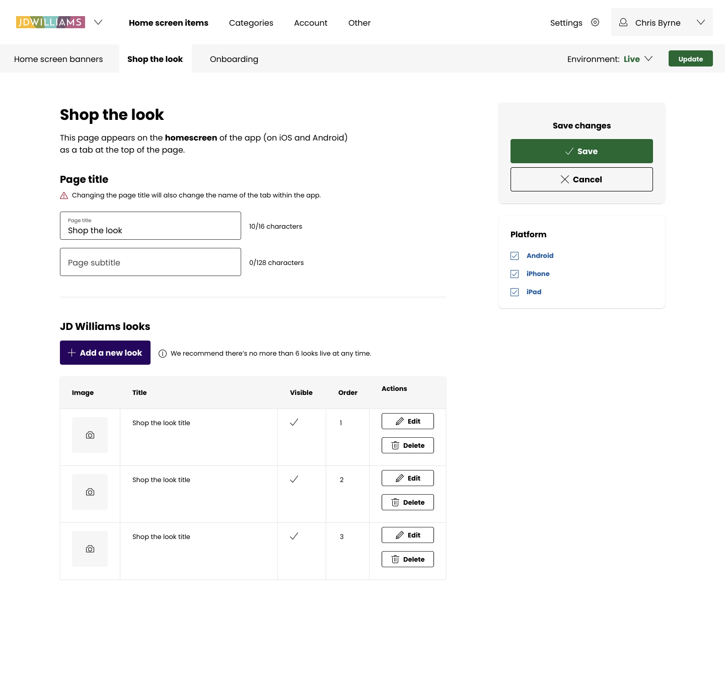
Working together with CMS stakeholders and engineers to gather requirements, I created new designs for the CMS. The designs were shared weekly with the CMS and brand teams, only focussed on just the Shop the Look functionality - with the other areas redesigned after. Feedback was integrated into the designs to ensure all of the requirements were met.
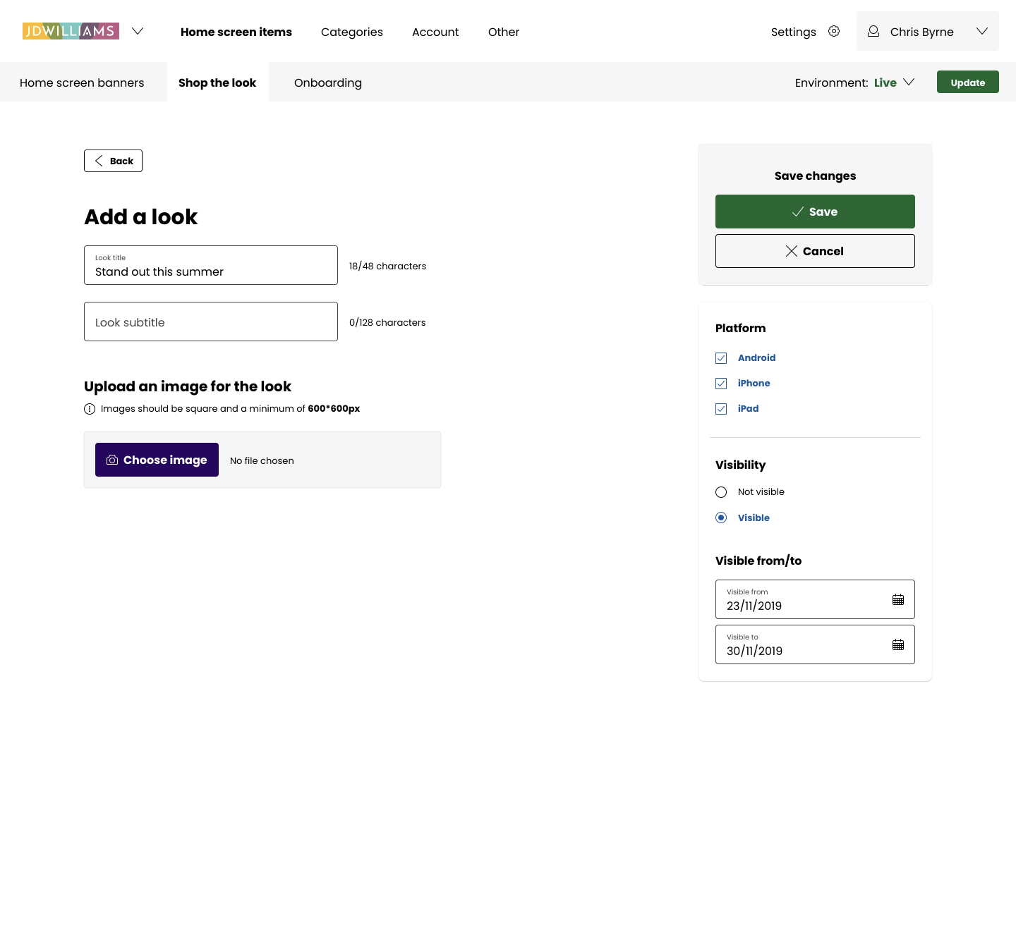
In the CMS it was important to be simple for marketers to use, so it was designed with hints, prompts and guidance in each area to make everything as straight forward as possible.
Within the CMS, marketers could manage multiple ‘looks’ within their brand area. Based on the data we gathered at the beginning of the project, we limited each ‘look’ to 5 pieces. We believed that any more items than this could lead to overwhelming the customer with too many choices to make.
They had the ability to add a main image, and add hot spots that were linked to products, and select the colours for each carousel background to match the uploaded image. They could also choose start and end dates for particular looks to tie in with campaigns, and choose the platform they were featured on (iPhone / iPad / Android).
Wrapping up
Takeaways 🥡
Overall, a success!
Shop the Look was very well received within the business and by N Brown's customers. 3 years later, the feature is still used within N Brown's apps, and its usage has extended to home and lifestyle, as well as fashion.
What would I change?
More user testing
At the time Shop the Look was designed, the UX team was quite young - we rarely tested new designs with our users prior to features going into development. The testing tended to happen with live features, often with A/B tests and occasional 1-1 user testing. If I was to design this again I would prefer to get a lot more user feedback at every stage to validate my decisions.
Add multiple items to bag
Technical and time constraints in the development phase meant that customers were unable to add the entire 'look' to their bag. This was planned for the second phase of the feature, but due to business decisions and roadmap changes, we never revisited this.
